On International Zero Tolerance on FGC/M Day 2017, Sahiyo is very happy to share it’s new look, with it’s new identity:

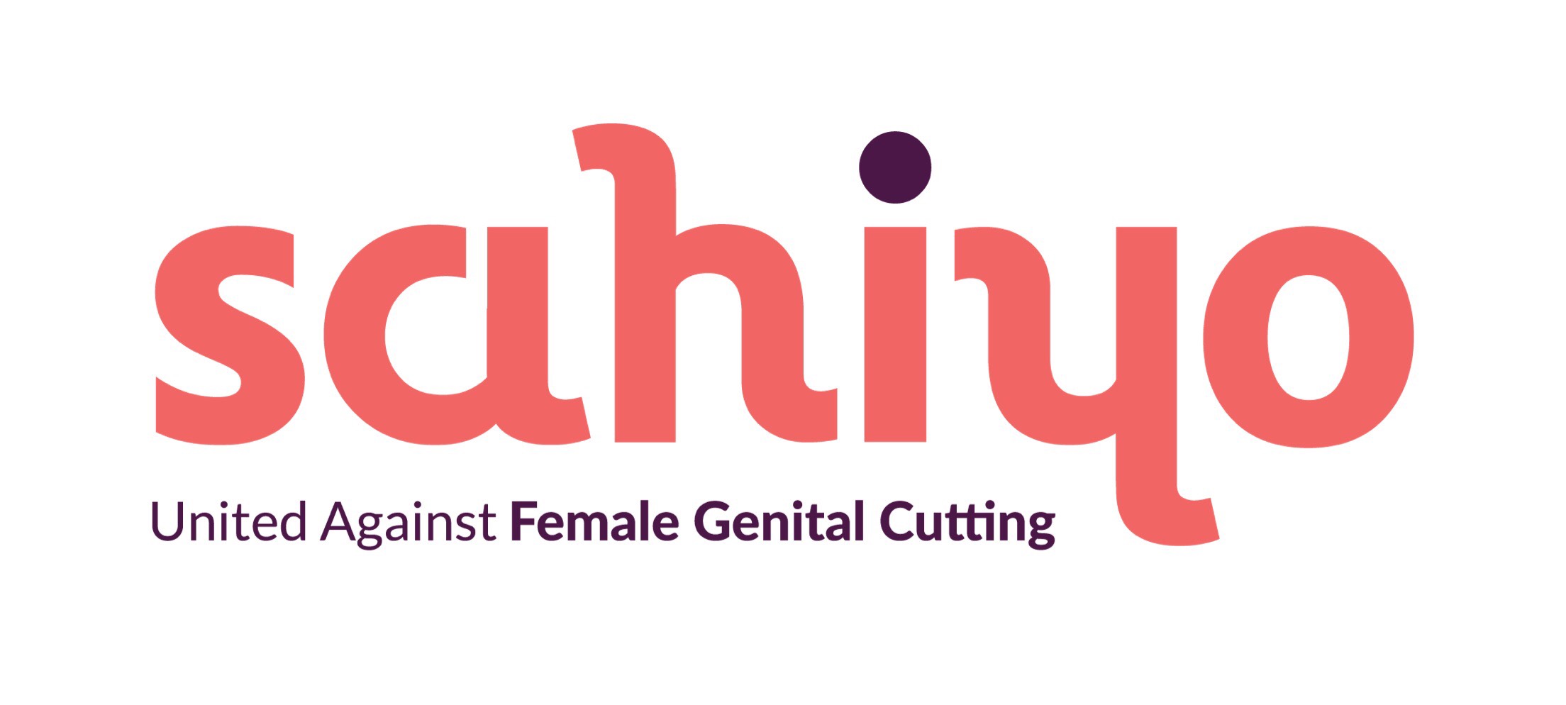
We have reinvented the Sahiyo logo in colors of peach and purple in solid, unique typography.
The typography illustrates ‘Sahiyo’ (Gujarati word for friends) written in English, at the same time connects to it’s Gujarati roots by depicting the letter ‘Y’ which could be read in both English and Gujarati lettering.
We have chosen colors peach and purple to communicate strong positive vibrancy of the work that we do.
In the words of our designer Dhwani Shah,
To me it (the logo colors) reflects determination of the team to work on the issue. Peach as a color is close to skin and can be drawn as a parallel to body positivity.
To us the combination is a statement on vibrancy as well as our continued struggle.
While peach symbolizes postivity, purple is a color of struggle with it’s long standing connotations of resistance within the feminist movements.
We hope you like our new look!


